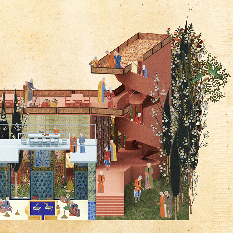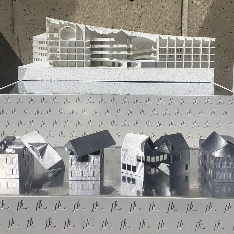
The project brief invited inspiration from typography and font systems. We began by documenting the architectural “vocabulary” of serif and sans serif fonts across Somerville, translating their contrasts into a housing scheme that merges student housing with moments of luxury. In this post-luxury society, the baseline is student housing, punctuated by controlled insertions of high-end spaces. Serif forms—respectable,ornamented, and precise—defined the façades of these luxury insertions, while sans serif volumes shaped the more generic, collective housing fabric. The interplay of the two created a norm-core texture that is familiar yet layered with idiosyncrasy. Drawing from Somerville’s Victorian vocabulary, elements such as arcbays, conic dormers, turrets, and window wraps were reinterpreted as typographic embellishments, concealing expansive curved interiors beneath modest envelopes. This strategy allowed ornament to hint at complexity without breaking the overall urban texture. The final massing responded to FAR requirements and the inequities of the local housing market, while proposing a formal position on architecture as “letterform.” Serif and sans serif architectures alike produced non-legible letters, framing a built environment that oscillates betweenthe generic and the extraordinary. Ultimately, the façade became the mediator between the two housing types. Serif geometries signaled and spatially carved out moments of luxury within the plan, while sans serif repetitions reinforced the efficiency of student housing. The envelope’s typographic moves were not simply cosmetic—they restructured interior conditions, redistributing space and redefining the relationship between collective and private dwellings.